'Age of Empire', Art Guide Australia, by Andrew Nicholls

Mangia Gelato (Piazza del Poppolo), Large Format photograph, 150 x 120 cm, 2015-2018

Mangia Gelato (Piazza del Poppolo), Large Format photograph, 150 x 120 cm, 2015-2018

Age of Empire, review of Hyperkulturemia by Sheridan Coleman

After reading at Oxford or Cambridge, the sons of England’s 18th-century peerage had one great rite of passage ahead: the Grand Tour. In their teens and twenties, the upcoming gentry went abroad, sometimes for several years, to taste the cultural delights of Europe. In Italy, facilitated by chaperones and family money, they would cultivate good taste and worldliness by encountering the art and architecture of the Renaissance and classical antiquity. “This was literally the beginning of tourism, of travel for pleasure and edification rather than commerce, war or marriage,” explains artist Andrew Nicholls. Hyperkulturemia collects the artist’s forays into the romance and revelry of the tour.

Visiting Florence in 1817, the French writer Stendhal approached the tombs of Machiavelli, Galileo and Michelangelo in the acoustic, vaulted Basilica of Santa Croce. Moved by the significance and nearness of this monument, Stendhal experienced a kind of cultural panic attack; dizziness, weeping, intense emotion and collapse. A contagion of theatrical public swooning at famous landmarks (known as Stendhal Syndrome or hyperkulturemia) swept among the British. “It’s a wonderful idea,” says Nicholls, “that a work of art could induce this overwhelming corporeal effect.”

Though hyperkulturemia is nonsense medically, the condition became a fixture of the tour experience, helped along by other factors: “It was summer, the galleries were crowded,” explains Andrew Nicholls. “These English boys were likely hungover and of course they wanted to appear in possession of a refined sensibility.”

Has Nicholls ever experienced hyperkulturemia? “On my last day in Florence I was exhausted − galleried out − but I took myself to the Bargello. I saw some Michelangelos and a fantastic Adonis. Then I went upstairs. Donatello’s David was across the room.” Reproductions had turned Nicholls off the bronze: “its androgyny, the fruitiness, the weird hat; ordinarily I’d be all for it, but it made me uncomfortable. Yet, the second I set eyes on David, it transfixed me. I spent two hours just circling it.” In Stendhal Syndrome #1, 2015–17, Nicholls is photographed mid-faint, walloped by the sheer immediacy of the effete, contrapposto David.

Itineraries listed in 19th-century diaries and letters helped Nicholls to plot a series of residencies across The Boot. These memoirs described the English ambivalence for Italian food and people, and their indulgence in parties and prostitutes.

Nicholls noted a disjuncture between the tour objectives of improvement and its resemblance to a rollicking gap year. “They were England’s next generation of leaders,” he says, “but they were also young, wealthy and barely supervised.”

The lasciviousness of the continent was not lost on their parents. “There was a culture of panic around the returning sons: bewigged bi-cultural creatures, called Macaronis, dropping Italian and demanding pasta. Many had contracted syphilis or gotten someone pregnant.”

Hyperkulturemia had a long germination which began, curiously, with a Spode meat platter: “I remember obsessively staring at it as a child, in the family dining room.” This early experience of being starstruck by an art object was brought on by an English-designed Arcadian landscape, printed in cobalt on white porcelain. “An artist composited it from bits of Italy on their Grand Tour. Those imperial complexities are really important for the show.”

Supported by a local government travel fellowship, Nicholls set off with a rota of young male models, artists and companions. He walked the ruins of Hadrian’s Villa, partied in Venice, wore britches and white makeup in the piazze and hiked up aching-to-erupt volcanoes.

“On my 40th birthday I climbed Campi Flegrei,” he recounts. “There was steam rising and yellow sulphuric rock in the crater. Boiling mud flew onto my arm, which felt like a blessing from Vulcan; and very much in the spirit of the tour.”

Nicholls carted a long scroll of paper onto which he made a slowly unfolding tour memoir: marble gods, cracked Corinthian columns, cobbled roads and his models, finely drawn in pen. Like the tourists, the completed frieze, Via Appia Antica (After Piranesi), 2016–18, imbibes the beauty and wisdom of the ancient world through its surviving monuments.

Festoons of cast porcelain bones hang throughout Hyperkulturemia; skulls and femurs ornamented with flowers in mimicry of Spode and Wedgwood. Made in Jingdezhen, China, the bones riff on the chinoiserie of the Nicholls family china, and Nicholls’ visits to Catholic ossuaries and reliquaries where rib shards and splinters of saintly scapula are enshrined in hammered gold.

In The Attitudes, 2015–18, Nicholls’ model, David Charles Collins, poses nude and splendid amid ruined aqueducts and stands of cypress. “With David’s physicality I could play with the symbolism of Italy as this place of transgressive sexuality and freedom,” says Nicholls. “He could pass as English aristocracy, yet he’s also somewhat godlike.”

Sensual liberties of the past, like the after-dinner entertainments of the British Ambassador’s wife in Naples or the buttocks of the Venus de Medici, polished to a gloss by centuries of appreciative patting, reverberate through Nicholls’ photographs: the beau in Mangia Gelato, 2015-18, slowly licks fior di latte gelato, his gaze smouldering beneath curls.

With his English-Catholic heritage and besottedness with the promise of Italy, it’s tempting to see Nicholls as a Sebastian Flyte figure (of Brideshead Revisited). Yet despite his lyricism, the artist handles history deftly and persuasively. His work reminds us of the causal and familial relationships between antiquity and our lived, contemporary culture. Secreted in the ink drawing Via Appia Antica are some trees drawn directly from his Spode platter. Italy, empire, antiquity and Nicholls’ travels coalesce in this unassuming detail. “I’m using the platter for a celebratory dinner tonight,” he says, on the last day of 2018. “I’m making a beef wellington.”

'A tongue-in-cheek tour', Seesaw magazine by Andrew Nicholls

Stendhal Syndrome #2 (Museo Archeologico Nazionale di Napoli), giclée print, dimensions variable, 2017-2018. Image c/o the artist.

Stendhal Syndrome #2 (Museo Archeologico Nazionale di Napoli), giclée print, dimensions variable, 2017-2018. Image c/o the artist.

'A tongue-in-cheek tour', review of ‘Hyperkulturemia’ by Miranda Johnson.

The Grand Tour was an exclusive educational holiday, primarily undertaken by sons of the aristocratic class in Britain, to “finish off” their education, escape the repressions of British society and assert themselves as the cultural, political and social elite. Andrew Nicholls’ “Hyperkulturemia” at the Art Gallery of Western Australia takes this narrative, with all of its implied debauchery, experimentation and excess, and slyly pokes fun at its over-the-top, camp style, whilst imagining and enacting the kind of pleasures these men may have experienced whilst touring the classical sites of Europe. It’s tongue-in-cheek, camp and slyly humorous, but also reflects deeply on the narratives of masculinity and its connections to culture and power, both in the past and present.

A combination of drawing, ceramics and photography, the exhibition takes as its starting point the affliction of its name –  “hyperkultumeria” translates to “too much culture in the blood”. This affliction was thought to be a cause of the possibly-fictional Stendhal syndrome, named after the 19th century French writer Stendhal who spoke of the ecstasy he felt when faced with the immense artistic beauty of Florence’s city and museums – so much so that he collapsed into a faint. As recently as 2018, a tourist suffered a heart attack in front of a Botticelli, an occurrence that is echoed in the photographs that guide the viewer into Nicholls’ exhibition. Both images show the artist overcome with beauty in the middle of sites of Italian cultural heritage. In these images, the groups of camera-laden tourists, the reflection of a colourful information sign, and the sunglasses comically resting on the floor a few feet from the artist’s prone body make it unclear whether he has collapsed due to the overwhelming beauty of the art or the hordes of tourists, queues and selfie-sticks that have become the modern affliction of cultural tourism.

Straddling the past and present, Nicholls expertly weaves historical and fictional narratives of the Grand Tour whilst refocusing themes of cultural capital and fraternity in his present reality of the WA art world. A further layer to the show is the series of collaborative ceramics, made with local artists whilst Nicholls was in residence in Jingdezhen, China. This collaboration resulted in several intricately decorated Etruscan-style ceramic vases, referencing dramas from Ancient Greek mythology, including the tragic drowning of Hadrian’s lover Antinuous, Zeus and Ganymede, and Theseus and the Minotaur. By placing these vases at the centre of the exhibition, both the ancient Romans’ cultural appropriation and the dominance of Western art in our current (and historical) memory are centred, reminding the viewer of the many other historical centres of art-making that have been overlooked, appropriated or discarded.

These ceramics continue as a “memento mori” motif throughout the photographs and drawings, in the form of bones and skulls, framing some of the works in a morbidly decorative manner that beautifully reflects the numerous crypts, catacombs and graveyards scattered throughout European cities – particularly the heavily Catholic ones.

Whilst I understood the contrast between the fragile beauty of the youthful male form shown in the works and the reminders of death and decay surrounding them, I felt that the detailed handiwork of the  collaborative ceramic vases and intricate drawings was a little overshadowed by the vast richness of this juxtaposition of bone and photographic image.

Exquisitely detailed with multiple narratives, high drama and wicked humour, The Last Judgement, a homage to Michelangelo’s iconic work of the same name, takes the original work’s imagining of the second coming of Christ and, using some of Nicholls’ friends and colleagues as models, reimagines this conversation between the damned and the saved souls of Heaven and Earth as, presumably, taking place in the male homosocial relations of the Perth art world. It’s a beautiful and surprisingly funny work, as the familiar faces of my colleagues and friends emerge from the campy drama of fleshy torment – and pleasure.

Similarly Via Appia Antica (after Piranesi), a composite image of Nicholls’ favourite sites of Italy, rewards a close look. Nicholls worked on this piece throughout his travels, over the course of two years, adding to it whenever possible. It’s an elaborate study of the architecture, landscapes and people of Classical antiquity, many of which are instantly recognisable as the iconic buildings, streets and bridges of today’s Italy. The work is again framed by ceramic bones, which, whilst striking individually, distract slightly from the intricacies of the drawn work. In this way, the exhibition as a whole provides a little of the overwhelming feeling of intense visual stimulation that presumably provokes Stendhal syndrome, with its robustly rich themes of flesh, decay and beauty. The drawn mountain-top of Vesuvius emerging at the centre of Via Appia Antica is a more subtle yet more chilling reminder of the inevitability of death than the “in-your-faceness” of the bones encircling richly-hued photographs of the muscular male form.

“Hyperkulturemia” is a study in contradictions – overwhelming and unsubtle in its glorious celebration of the relationship between masculinity and cultural capital, yet critical of this relationship, aware that other, more delicate narratives can emerge between the cracks.

'Fragile Flesh', Australian Journal of Ceramics by Andrew Nicholls

Brent with Porcelain Skull (Portrait of Brent Harrison), digital print, 2016

Brent with Porcelain Skull (Portrait of Brent Harrison), digital print, 2016

Fragile Flesh: The Works of Andrew Nicholls, Nathan Beard, and Susan Flavell, by Travis Kelleher

Despite the closure of major facilities across Australia during the past decade[i], recent years have seen a resurgence of ceramics practice internationally, in particular by visual artists from a non-craft background approaching the medium from an historical and conceptual perspective.[ii]Nathan Beard, Susan Flavell, and Andrew Nicholls are three such Perth-based visual artists, whose shared interest in the body has seen them embrace the discipline, drawing particularly on its historical context in relation to race, gender and class.

Nicholls, whose practice is largely centered around illustrative ink drawing, owes his aesthetic sensibility to a Spode Italian meat platter that hung on the dining room wall of his family home. Fascinated by it as a child, the platter’s enduringly popular blue and white pattern – in continual production since 1816[iii]- worked its way into his psyche from an early age. At university he came to appreciate its cultural lineage, reflecting the economic rivalries of East and West during the 18thcentury as Europeans developed the techniques to produce their own ceramics, rather than having to import wares from Asia.[iv]In 2004 he undertook a residency at the Spode factory in Stoke-on-Trent, the first of many such international pilgrimages he would curate for himself and others, seeking to unpick the darker historical motivations of aesthetic legacies we commonly consider benign. ‘Of all the great British china factories, Spode more than any other has always glorified its colonial roots,’ Nicholls explains, ‘iconic patterns such as Indian Sporting,which depict hunting expeditions from the British Raj, have been in almost-constant production for over two centuries. It’s staggering to me that people have such cosy associations with objects depicting colonists killing bears and wolves, or being attended to by slaves.’[v]His Australian Sporting series, produced at the factory utilising centuries-old copper plates, presents an Australian colonial drama set on stark white bone china, in dubious homage to Spode’s iconic Indian designs.

For Nicholls, Britain’s commercial ceramics industry is inescapably linked to decline, violence, and death, and driven by the racial tensions that emerge from colonial expansion. Nothing embodies this chequered history better than the ubiquitous Willow Pattern: probably the most popular china motif ever conceived, and still frequently assumed to be Chinese in origin, it is actually chinoiserie, invented by the English – possibly Spode himself – to undercut the Asian domination of the ceramics market.[vi]The iconic pattern, and Nicholls’ fascination with George IV’s orientalist pleasure palace, Brighton’s Royal Pavilion, inspired his current group curatorial project: ‘chinoiserie remains something of a guilty pleasure, via its undeniable aesthetic charm, but intensely problematic and kitsch appropriation of Asian culture. It reflects the worst excesses of colonial imperialism, yet reflects a level of fascination for the Asian ‘other’ that can be read as (albeit naively) cosmopolitan in spirit’.[vii]The project, currently in progress, invited fourteen Australian artists, including Beard and Flavell, to interrogate this aesthetic legacy, informed by residencies at the Royal Pavilion and The Pottery Workshop in Jingdezhen, China.[viii] 

Nicholls’ series of ceramic skulls and crossbones were produced for the project in collaboration with various Jingdezhen makers, and reflect his fascination with mass aesthetics. He explains, ‘I liked the idea of taking a symbol as cringe-worthily overused as a skull to symbolise the violence of British imperialism. However for me the works also talk more broadly about the decline of the commercial ceramics industry, and the failure inherent to the bourgeois aspirations it has always capitalised on, as well as the literal use of dead organic matter to produce bone china, the English substitute for porcelain’.[ix]A photographic portrait of his friend, emerging Perth artist Brent Harrison, staring wistfully at one of his porcelain skulls is a contemporary Vanitas, Harrison’s supple body contrasting with the bone-like appearance of the fired clay, recalling medieval ‘Death and the Maiden’ motifs.

Rituals and traditions surrounding death also inspired Beard’s first foray into ceramics in 2014. Beard’s multidisciplinary practice scrutinises his Thai-Australian heritage, and is particularly driven by newly taken and found photography: his installation Avunculus Vale featured an arrangement of ceramic ‘bone’ fragments referencing Thai death customs, displayed alongside confronting photographic banners of his uncle’s corpse, decorated festively in line with Thai tradition. From there the ceramic medium’s broader cultural legacy has resonated with his ongoing interests in kitsch, decoration, and the use of ornamentation in Thai religious, political, and funerary tradition. He frequently makes use of lustres and iridescent glazes to evoke this sensibility, as in a recent series of ceramic tiles reinterpreting family photographs found in his mother’s abandoned house in Nakhon Nayok. Again, these works centre upon imagery of his deceased uncle, his figure obscured from his wedding photographs by metallic PVD, simultaneously glorifying and obscuring him, as if mimicking the processes of memory and nostalgia.

Beard’s recent series of porcelain Buddha heads, Oriental Antiques, was based on his photographs of Thai artefacts from the British Museum. Jingdezhen sculptors were given the images as reference shots, their flattened perspective subsequently transposed into the objects, lending them a subtly off-balance physiognomy as if literalising the layers of inquiry imposed on such objects in a post-colonial institutional context. A related pair of (as yet unexhibited) monumental ceramic interpretations of the hideously kitsch Princess Diana memorial at Harrods makes similar use of distortion through the translation of the original (in itself, arguably, not particularly lifelike) sculpture into Beard’s photograph of it, then via the hands of Jingdezhen craftsmen, and the inevitable warping that occurs during firing. Both series draw from the centuries-old history of memorialising heroes and celebrities in clay to transform cultural icons into imperfect human bodies. 

Memorialisation is also central to Flavell’s ceramic works, which in line with her broader sculptural practice is also deeply entrenched in the corporeal, in particular the relationship between the human and the animal. Her works from Jingdezhen included a series of exquisitely sculpted, life-sized busts of her beloved (and recently deceased) dog Dottie, lending the pet the status of a Roman emperor and recalling the ambitious scale of Augustus the Strong’s porcelain menagerie.

Flavell first embraced ceramics through a Mark Howlett Foundation commission in 2010, which allowed her a year of development time in which to master the discipline via a series of stately slipcast figurines of hybrid creatures. A seminal series of works inspired by Sigmund Freud’s collection of antiquities, Freud’s Desk, followed in 2013, informed by a group residency curated by Nicholls at London’s Freud Museum. The series comprised 100 small works tumbled, seemingly, directly from Flavell’s own unconscious, through which she first began combining ceramics with numerous other mediums, the resulting figurines then further embellished with junk jewellery and other found objects. This sensibility reached its zenith with her recent work for the 2016 Bankwest Art Prize, a richly glazed and lustred raku and porcelain Piggy Bank incorporating a dazzling array of other materials and processes, listed by Flavell in the exhibition catalogue as “…recycled papier mâché, glue, glitter, marble dust, found industrial wooden form for casting, wood, MDF, found fake pearls, found jewellery, gold coin, Chinese note, insect body, seeds, drawing, stoneware, amethyst, marbles, bronze, gold, hair, love, and hope”.[x]

Approaching the medium as a mid-career artist, the plasticity and unpredictability of clay strongly resonated with Flavell.‘Ceramics has a similar alchemy to metal casting,’ she notes, ‘the object that goes into the kiln and the object that comes out are not the same…colours change, forms shrink. As a sculptor working in the medium of ceramics I embrace the accidents, the chance happenings, the bent, the deformed and the lopsided.’In her works the body is almost always in flux, always on the verge of becoming something else, sometimes seeming to barely hold together, yet always replete with boundless possibilities, corporeal and erotic. Her use of materials aims to overcome the limits of the body in its hybridity and dizzying array of surfaces. Many of her earliest ceramic works juxtaposed her drawings incongruously onto their surface, heads and limbs overlaid onto non-related body parts, while her later series frequently incorporate Freudian humour, with eyes peering from orifices, or flowers erupting phallically from crotches and torsos. Her busts of Dottie therefore represented a new direction in their realism, but were created with the knowledge that the beloved companion was nearing the end of her life; like Beard’s works, they continue the historical use of ceramics to memorialise.

Few artistic mediums are as durable, yet as easily-broken as ceramics. Though diverse, Beard, Flavell and Nicholls’ practices each make use of these qualities to interrogate the body and its fragility in the world. As Bryan Turner notes, ‘We need arguments that flesh out the commonalities of the human, especially social, experience. I use “flesh out” deliberately. We can make the cosmopolitan argument more convincing through the argument that the vulnerability of the human body provides the starting point for an account of human commonality as the basis for a cosmopolitan ethic.’[xi]For Beard, Flavell and Nicholls, based as they are in Perth, the history of the medium in the West, already colonial by default, is further filtered through a post-colonial lens. Intimately tied to centuries of racial and economic rivalry, the medium is, by extension, of relevance to the instability of corporeal identity in a contemporary world, where cultural lineage and the borders between nations are more fiercely debated than ever, and where eminently fragile bodies are at stake. 


Travis Kelleher, 2017


[i]McCallum, L., (2015). Pathways to Practice. Journal of Australian Ceramics 54(3), 76-79.

[ii]The high profile of awards such as the Sydney Myer Fund Australian Ceramic Award and the Gold Coast International Ceramic Art Award reflect this trend, the former changing from an international to an Australian-only award in 2009 in recognition of the quality, diversity and breadth of the medium in Australia.

[iii]Drakard, D. and Holdway, P., (1999). Spode, transfer Printed Ware, 1784-1833, ACC Art Books 

[iv]Beddoe, S., 2008. ‘‘Prodigious Charming Pots…’ British Chinoiserie Ceramics’, Chinese Whispers, Chinoiserie in Britain, 1650-1930, The Royal Pavilion and Museums, Brighton and Hove, pp. 30-31.

[v]Interview with the artist, February 2017.

[vi]Haddad, J. R., ‘Imagined Journeys to Distant Cathay: Constructing China with Ceramics, 1780–1920’,Winterthur Portfolio, Vol. 41, No. 1 (Spring 2007), University of Chicago Press, pp. 53-80

[vii]Interview with the artist, February 2017.

[viii]The three artists all acknowledge the ongoing mentorship of senior Western Australian ceramicist Sandra Black, who has assisted them throughout their exploration of the medium, and hosted them during the Jingdezhen residency.

[ix]Interview with the artist, February 2017.

[x]Murray S. (Ed)., 2016 Bankwest Art Prize, Bankwest, Western Australia, 2016, p. 27

[xi]Turner, B. (2002). Cosmopolitan Virtue, Globalization and Patriotism. Theory, Culture & Society, 19(1-2), 45-63.

Purchase the print issue at:

https://www.australianceramics.com/product/the-journal-of-australian-ceramics-vol-56-no-1-april-2017

'Outrageously Aesthetic: the Art of Andrew Nicholls', Sturgeon Magazine by Andrew Nicholls

Untitled (cobalt skull), Andrew Nicholls in collaboration with Yu Xuan and Jingdezhen artisans, hand painted cobalt on porcelain, 30 x 35 x 35 cm, 2016. Photograph by Bewley Shaylor.

Untitled (cobalt skull), Andrew Nicholls in collaboration with Yu Xuan and Jingdezhen artisans, hand painted cobalt on porcelain, 30 x 35 x 35 cm, 2016. Photograph by Bewley Shaylor.

Outrageously Aesthetic: The Art of Andrew Nicholls, by Macushla Robinson

When Perth based artist Andrew Nicholls was growing up, a ceramic meat platter hung on the wall of his parents’ house. The platter depicted a picturesque Italian landscape with ruins by a river, in the famous blue-and-white pattern of British ceramics factory Spode. The platter was a wedding gift to his parents from his “aspirational” aunts who ran an antiques stall. Years later it would become central to Nicholls’s career as an artist. After completing his sculpture degree he spent long hours in his tiny Perth studio, his drawing pad his primary resource, and it was then that he began rehearsing Spode’s iconic Blue Italian design from his childhood  along with patterns by Wedgwood and Royal Doulton.

Commercial British ceramics, with their bucolic faux-Rococo landscapes blending Italianate and Chinese styles, might seem innocuous and quaint. Yet as affect theorist Sianne Ngai suggests, marginal aesthetics such as ‘cuteness’ are “a way of aestheticizing powerlessness [that hinge] on a sentimental attitude toward the diminutive and/or weak.”. The sidelined status of British ceramics, which are categorised as ‘decorative arts’, reveals society’s aesthetic prejudices—the hierarchies that play out in taste. Such objects have emerged out of historically specific circumstances that embody both class and colonialism.

Purchase the print issue and read more at:

http://sturgeonmagazine.com.au/outrageously-aesthetic-the-art-of-andrew-nicholls/


'Year of the F**king Monkey', Artsource Magazine by Andrew Nicholls

Andrew Nicholls in his studio at The Pottery Workshop, Jingdezhen, China, in May, 2016. Image: Nathan Beard

Andrew Nicholls in his studio at The Pottery Workshop, Jingdezhen, China, in May, 2016. Image: Nathan Beard

http://www.artsource.net.au/Magazine/Artist-Features/Andrew-Nicholls

Andrew Nicholls: Year of the F**king Monkey, by Thea Costantino, 2016

I write these words as the news of Donald Trump’s presidential election sinks in, the latest dispiriting moment of 2016; a year that Andrew Nicholls repeatedly tells me is cursed. He blames the cosmic influence of the Year of the Monkey, which happens to be the astrological sign I was born under. I don’t take his refrain of “f**king monkeys” personally; it’s true, we are living through grim times. The growing strength of a revanchist right wing movement that yearns to restore a pre-civil rights social order presents a tangible challenge to those who hope for a society based on equality and justice. This might seem like a strange opening for an artist profile on Andrew, but in fact it is a perfect entry point into the cultural themes that he grapples with in his practice as an artist-curator.

If I labour this point, it is because the decorative aesthetics of Andrew’s artwork sometimes lull his audience into a reverie that is both deceptive and biting. He employs materials and techniques traditionally marginal to the fine art canon, belonging to the ‘applied’ arts of illustration and craft, and his work is suffused with an ornamental aesthetic at odds with the self-professed modernity of contemporary Australia, or Anglophone culture in general.

The deployment of markers of luxury and desire in his work is political, in the sense that he follows the historical interplay of aesthetics and power. Rather than offer a nostalgic image of the past, Andrew’s borrowing from historical sources draws out continuities and ruptures with history, such as Europe’s predatory relationship to its others, and shifting codes of male homoeroticism since the eighteenth century. Through exploring histories of the politics of taste, he is led to consider themes that continue to drive ideological rifts in contemporary life: imperialism, memory, gender and sexuality.

Andrew is probably best known for intricate pen drawings in which the restrained beauty of neoclassical modes is subverted by a hallucinatory frenzy of ornament. In Via Australiano Antica #1, for example, native Australian flowers frame the posterior view of a classical warrior in marble, replete with the cracks of deep age. The incongruity of this juxtaposition elegantly points to Australia’s fraught relationship to what was known as the ‘European inheritance’: the ostensible cultural lineage connecting ancient Greece and Rome with their more recent legatee, the British Empire and its colonial outposts. Around the time of Federation, the project of an Australian national identity based on classical and British imperial models was troubled by anxieties about the morality of the colony, an obsession with the maintenance of white racial supremacy, and a preoccupation with the decline of empires. Andrew’s intervention seems to suggest the receding of an idealised imperial past and its erosion by the forces of nature, an evocation of the Australian Gothic in which the white settler is haunted by the fear of a hostile and ill-gotten landscape.

He applies a related strategy in his ceramic work, investing such genteel household objects as a dinner platter with imagery that spews forth anxieties and feverish desires properly supressed in bourgeois Australian society. His recycled Wembley Ware dinner service Bitter Heritage, for example, references the bleak narrative of Randolph Stowe’s novel Tourmaline, in which a messianic outsider is feted and then abandoned by a post-apocalyptic mining town in Western Australia. In the composite image formed by the plates, crows feast upon the prostrate figure of the Water Diviner, lost in the desert, drawing our eyes towards the centre of the installation to meet the subject’s melancholy gaze and red-framed genitalia.

Across the broad range of his work, Andrew draws out and revels in posing threats to the colonialist and heteronormative values of contemporary culture. With such interests, it’s not surprising that he has been drawn to the life and legacy of Sigmund Freud, whose theories can offer a great deal when considering histories of power and desire. In 2013 he led a group residency with seven Western Australian artists, myself included, at Freud’s final house, now a museum, culminating in the 2015 exhibition An Internal Difficulty: Australian Artists at the Freud Museum London. Andrew’s curatorial practice is driven by a site-based methodology that requires artists to undertake research in specific places and to develop artworks in response to the experience.

It’s a particularly rewarding process as an artist, as it involves working as part of a collective and shaping the exhibition through a shared set of discoveries. Through his curation of the Freud Museum project, we participating artists were able to offer a range of responses to the site, which addressed overlapping concerns about gender, the body, desire and cultural memory.

An even more ambitious curatorial project currently in development is A Gentle Misinterpretation: Australian Artists and Chinoiserie, which has involved 13 artists and two site visits: the first at George IV’s extravagant Chinoiserie palace in Brighton, England, and the other at The Pottery Workshop in Jingdezhen, China. Andrew’s strategy for considering the West’s historical hunger for, and appropriation of, Asian aesthetics brings artists to specific sites of consumption and production, while allowing for counter narratives and points of contestation to emerge.

He explains, “Chinoiserie remains something of a guilty pleasure, via its undeniable aesthetic charm, but intensely problematic and kitsch appropriation of Asian culture. It reflects the worst excesses of colonial imperialism, yet reflects a level of fascination for the Asian ‘other’ that could be seen as (albeit naively) cosmopolitan in spirit. This exhibition invites a number Western Australian artists to develop new works investigating this aesthetic legacy.”

To try to encapsulate the multi-threaded nature of Andrew’s practice and his broad interests is not easy. I might hazard a sweeping generalisation and say that as a whole, his practice offers a critique of the project of European modernity and the horrific consequences born of attempts to craft this concept into reality. Andrew’s work lends itself to Freudian terms of interpretation; like an erotic nightmare, his work suggests the unbidden incursion of repressed material, tracing pathological tendencies in western culture through its appetites and symptoms. In this sense, he offers an important counter narrative and, perhaps, an antidote to the totalitarianism of our times.

'A Gentle Misinterpretation and other works', GRIFT Magazine, by Andrew Nicholls

Andrew Nicholls in the Music Room of the Royal Pavillion, Brighton, UK, 2015. Photograph by David Charles Collins, with thanks to the Royal Pavillion and Museums, Brighton

Andrew Nicholls in the Music Room of the Royal Pavillion, Brighton, UK, 2015. Photograph by David Charles Collins, with thanks to the Royal Pavillion and Museums, Brighton

A Gentle Misinterpretation and other works, interview by Jack Appleton, 2016

GRIFT: How would you describe your work to the uninitiated & what motives have driven your practice, to get you where you are today?

Nicholls: I work across a number of mediums, most importantly drawing, but also ceramics and, increasingly in recent years, photography. I’m primarily interested in power, and how power has been played out through aesthetics historically, so I like to reference styles that haven’t been treated in especially high regard by the ‘powers that be’ in the art world for much of the past few centuries of Western culture - the decorative, illustration, the domestic…and also I suppose, the opposite of that, properly ‘high art’ in the historical sense, by which I mean imperial and religious patronage – the two extremes of aesthetics, historically, I guess. I’m interested in aesthetics that are maybe taken for granted now, or have lost the significance that they once had, and in trying to make explicit some of the power-play that underpinned them, visual material that we might be inclined to think of as benign, but that historically sat at the nexus of really unpleasant and significant historical events, and reflected different attitudes of marginalisation based on class, gender, race, and so on. I then employ camp as a strategy to deal with this marginalisation. I ‘camp on’ various historical tropes as a way of re-empowering myself, and – hopefully - on behalf of other maginalised people who have tended to be excluded from history.

To read the full interview purchase a copy via:

http://www.griftmag.com/store

'A Gentle Misinterpretation, curated by Andrew Nicholls', ROOMS Magazine by Andrew Nicholls

Andrew Nicholls filming the work Gulchenrouz with model Luca Gatti in the Royal Pavilion. Image by Alexandra Loske, with thanks to the Royal Pavilion and Museums, Brighton. 

Andrew Nicholls filming the work Gulchenrouz with model Luca Gatti in the Royal Pavilion. Image by Alexandra Loske, with thanks to the Royal Pavilion and Museums, Brighton. 

http://www.roomsmagazine.com/artpeople/25/8/2015/a-gentle-misinterpretation-curated-by-andrew-nicholls?rq=andrew%20nicholls

A Gentle Misinterpretation, Curated by Andrew Nicholls, by Joshua Ward, 2015.

Andrew Nicholls’ latest collaborative project, entitled ‘A Gentle Misinterpretation’, brings together a group of Australian artists for two separate exhibitions at the Brighton Royal Pavilion inspired by the cultural effect and meaning behind the ‘Chinoiserie ‘ tradition from the 17th century, up until the 1920s in the Western world. The first residency took place in July and now, busy in preparations for the second residency taking place during August and plans for an exhibition in Perth next year, Andrew Nicholls answers my questions regarding the issues surrounding the ‘Chinoiserie’ culture.

How did your personal interest in a project revolving around the topic of ‘Chinoiserie’ begin to form?

This project has been in the making for 11 years, since I first visited the Royal Pavilion and fell in love with it. It’s my favourite building in the entire world, and I spent a decade waiting to find the right group of artists to take there. Last year I approached the Brighton Museum and Art Gallery with a request to undertake a group residency there, and thankfully they agreed.

However, my art practice has always been concerned by histories of decoration, and how they reflect their social context – the way that seemingly-innocuous aesthetic traditions actually grew out of quite nasty historical circumstances. British ceramics have been a major influence throughout my career – in fact, the first time I visited the Pavilion was when I was in the UK undertaking a residency at the Spode china factory in Stoke-on-Trent - and yet that entire industry was formed by appropriating techniques from Asia during the 18th century in quite an aggressive way, so the idea of cultural theft has been a major interest for a long time.

The Pavilion is the perfect symbol of all this, because it is so seductive. It is spectacular, and opulent and beautiful, and yet so many of the cultural references are so clumsy…and then at the same time it comes with all of the glamour of George IV who is remembered as one of England’s most self-indulgent, decadent, scandalous monarchs. So it is the ideal location to talk about the decadence of imperialism, and how this fed colonial expansion.

As a curator for this project, how did you go about finding or choosing appropriate artists for this residency? What qualities did you look for in the work of these artists?

I have a core group of artists I like to draw from in my freelance projects, all of whom enjoy taking inspiration from historical research, or in response to heritage sites. For this particular project I selected a number of artists from this group whose recent work has focused either on the relationship between Asia and 'the West', and the cultural and aesthetic legacies that this has inspired, or more broadly on tensions surrounding colonialism, nationalism and the crossing of national borders. The residency artists, Abdul Abdullah, Casey Ayres, Nathan Beard, David Collins, Thea Costantino, Travis Kelleher and Pilar Mata Dupont, have variously explored Eurasian identity, the experience of migrant communities in modern Australia, the marginalisation of minority groups within nationalism/colonialism, the plight of the refugee, and the legacy of colonial pillage.

Along with the eight residency artists, there are also four amazing senior Western Australian craft makers involved in the project, Sandra Black, Tanija and Graham Carr, and Marianne Penberthy, who will create works to complement the residency outcomes (in ceramics, leather and textiles, respectively). Each of these craft makers has drawn upon Asian tradition in one way or another in their works, and the objects they create will provide added opulence to the final exhibition. Given the George IV was such a significant patron of the arts, it feels appropriate to be commissioning new works by master craft-makers for this project.

You describe how ‘the sentimental’ is a ‘force driving mainstream culture’, which I find interesting. The concept of ‘Chinoiserie’ is almost the sentimentality of ‘Westerners’ between the 17th century and early 20th century for an ‘Asian’ aesthetic and culture. How do you feel this translates to artistry in our 21st century and why do you feel it is important to address this concept of ‘Chinoiserie’ now?

Chinoiserie was incredibly sentimental. It grew from an age when any international travel was difficult and dangerous, so the majority of designers, artists and writers who produced it had never been to Asia and probably had little desire to do so. Hence it was largely based on often-fanciful, second-hand accounts, and it often ended up being culturally insensitive or portraying Asian culture as primitive or brutal. But at the same time it was escapist, particularly for women who were largely tied to the domestic realm during that era. There is a lot of writing about the way that Chinoiserie provided escapism for women who would most likely never be able to travel the world themselves. From that sense it wasn’t ever really meant to be authentic in its portrayal of foreign cultures…not that that makes it alright!

In the 21st century I guess there’s a lot more movement between cultures, particularly in relation to materials and techniques, but I tend to be of the opinion that a lot of cultural content isn’t appropriate to reference. Non-Indigenous Australian artists are maybe more aware of this than most, because we sit alongside an incredibly rich legacy of Aboriginal art, that is absolutely not something we can appropriate or borrow from…but it will be a challenge with this project to walk that line between cultures.

One of the residency artists, Casey Ayres (who is of Chinese-Malay descent) compared the Pavilion to Disneyland, as he had expected the cultural references to be a little bit ‘off’, but wasn’t prepared for life-sized iridescent dragons and pillars in the form of palm trees. I think he felt there was an affinity there to his own cultural identity, but I’m not sure yet exactly what it was. He spent a lot of time filming himself in various parts of the building, so I’m excited to see what he comes up with over the next few months.

As well as being curator for this project, you yourself are a multi-disciplined artist who will exhibit work in this residency. The aesthetics of your work with paper and ceramics display an Asian influence most immediately to me, but I wonder how you feel the Asian culture or aesthetic influences your installation and photography - if at all?

In terms of my broader work, I think the Chinoiserie influence will be realized more in relation to decadence and luxury the movement represented, rather than a specific Asian influence. During the first residency in early July I filmed a model in the Pavilion who was meant to represent a sort of spectre of Regency decadence, mixed with a character from William Beckford’s Vathek, (an incredibly lurid Orientalist-Gothic novel set in a mythical version of Saudi Arabia). I’ve challenged a composer I work with, Ewan Jansen, to write some Regency-inspired music for it that somehow points to a kitschy ‘Orientalist’ influence. I’m not sure how that will work out, or if it’s even possible to make it clear that the cultural appropriation is ironic. Probably it’s not, and we’ll have to abandon the idea, but that failure in itself may trigger something interesting.


'The Water Works' exhibition review by Andrew Nicholls

Another kind of Merman, decal transfer on recycled Wembley Ware porcelain (c 1950), 12 x 20 x 2 cm, 2013

http://dailyserving.com/2013/11/andrew-nicholls-the-water-works-at-turner-galleries/


Andrew Nicholls: The Water Works at Turner Galleries, by Thea Costantino, 2013

Australian artist Andrew Nicholls dredges the queasy aesthetics of sentiment for its submerged ideological content. In an ongoing thread of his practice, he locates the ideals and practices of British imperialism in the kitsch, seemingly innocuous world of 19th- and 20th-century ceramics, disrupting this historical narrative with traces of the otherness otherwise repressed in the imperial worldview. He subsumes his viewers in an undertow of horror and desire.

His latest exhibition The Water Works at Turner Galleries features a body of aquatic-themed drawings and sculptures in which the maritime environment serves as a spawning ground for all manner of fantastic inversions of the so-called natural order. With characteristically acerbic humor, Nicholls re-situates ancient depictions of the ocean as a site of monsters and wondrous perils in the context of mass-produced ceramics, eroticized male bodies, and mainstream Australia’s hysterical anxieties about invasion via its maritime borders. Amid ships on the verge of being wrecked and views of the glories of the deep, audience members clasp seashells to their ears only to hear water-themed excerpts from the artist’s music collection—the stylings of Destiny's Child bursting this exquisite dream bubble.

Of these somewhat marginal sound works, Nicholls states an interest in “exploring humiliation through my practice,” wanting to “trick my audience into feeling slightly embarrassed for me.” His glee in squirm-inducing effects is likewise embodied by the shark-man pinup sprawled across a ceramic serving dish, Another Kind of Merman, with his predatory roar, sprinkling of leg hair, and lovingly rendered genitalia.

Nicholls' work touches on national shame in the nautical dinner set Australia Sinks, referencing the 2001 'children overboard' scandal when the then-ruling right-wing Liberal party concocted the great lie that a sinking boatload of asylum seekers had thrown their own children into the water in an attempt to force a rescue. This work reads in relation to the Libs' recent return to government under PM Tony Abbott, whose great election promise, other than to prevent same-sex marriage, was to 'stop the boats' and thus protect Australia from the perils of giving aid to the displaced. Staging this debacle on an entree and dinner plate, Nicholls pillories the bourgeois conservatism that Abbott and his ilk espouse.

The Water Works, in spite of its enticements, is thus an exhibition with barbs, flaunting the lavish colours of deadly creatures like the blue-ringed octopus, whose tentacles caress the sinking figure in A Coral Room (put your hand over the side of the boat and what do you feel?). Both drowned man and wet dreamer, this casualty of the deep exemplifies Nicholls' deployment of eroticism to explore a range of historically situated anxieties and desires.  

We Love Perth, 2012 by Andrew Nicholls

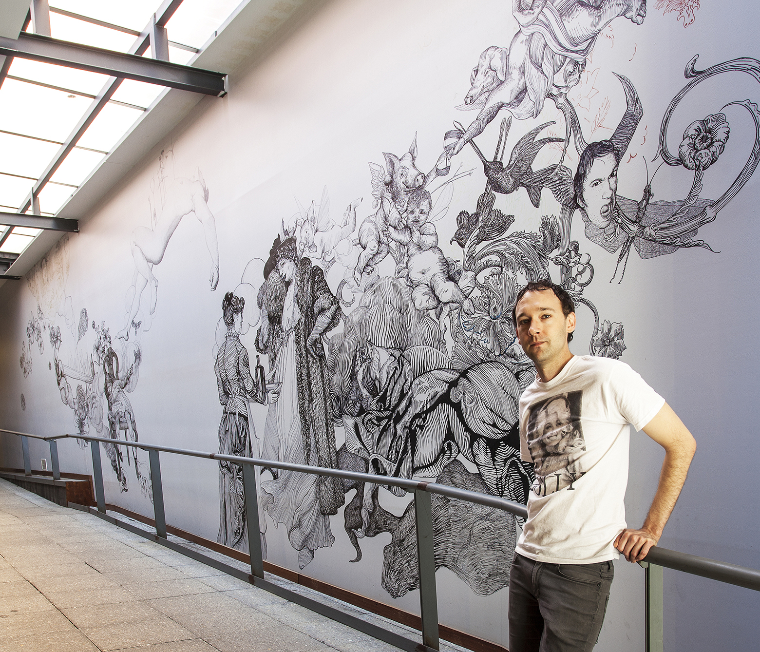
Andrew Nicholls with his mural at Zekka Designs for Men, 2012

http://weloveperth.net.au/the-creative-artist-andrew-nicholls/


The Creative: Artist Andrew Nicholls, by Jelena Maticevic, 2012

We are so incredibly excited to have artist, writer, curator and all-round very talented local Andrew Nicholls as our creative today. Many of you may know of his wall mural at the entrance of popular, city coffee spot Zekka, or have read a piece by him in the Australian Art Review, or perhaps admired his Spode china plates at the Art Gallery of Western Australia (seriously!) We know we’ve featured some fantastic local movers and shakers in the art scene so far, but this is my favourite interview we’ve done. In fact, I may even go so far as to say this is Creative Gold. Not only will you learn about the Spode Factory, but you’ll also get a glimpse into his favourite music and how it influences his art practice. If that doesn’t entice you to keep reading, then I really don’t know what else will!

Now before we get going, we should also let you know that Andrew is one of the artists taking part in FORM’s brilliant exhibition, Living Walls, an extension of their City of Walls project, which celebrates urban art and the role it plays in delighting and surprising its viewers. This exhibition will involve a mural by Melbourne artist Beastman on one of FORM’s gallery walls, as well as showcasing a collection of work by a mixture of artists, in the form of limited edition ‘paste-ups’. You can read more about it here, or on the City of Walls websiteLiving Walls opens on the evening of Thursday 28 June at FORM Gallery, with the exhibition running until August 25th.

To get you excited about Living Walls, read on for a brilliant interview with one of those artists, Andrew Nicholls. When I first read through his answers I couldn’t help but quote him out loud to my husband multiple times throughout the interview for both his humorous words and awe-inspiring career path. So a word of warning for anyone reading this in a quiet office, library or on the bus! Jelena.

Official job title: Artist, writer and curator.

Tell us a bit about your career background and how you’ve come to where you are now:

I have a short attention span, so I tend to have a number of irons in the fire at any one time: I’ve managed art galleries and curated for various organisations, produced a number of commissions (most recently for the City of Perth), I’ve worked as a tutor and lecturer for Curtin and Edith Cowan universities, and I managed a Royal Doulton shop for a number of years, a job that I absolutely loved. I’ve been lucky enough to work with uber-fabulous art/homewares company Third Drawer Down on limited-edition products (most recently a duvet cover) and I write and curate in a freelance capacity as well as making my own artwork… nothing horrifies me more than the prospect of full-time employment.

My own art practice is concerned with power, and how it has been played out at an aesthetic level, throughout the history of Western culture. I’m interested in marginalisation, and in revealing the histories of domination that underpin a lot of the imagery we tend to take for granted. Hence, I’m drawn to aesthetics that historically have not been taken particularly seriously – the decorative, the figurative, the illustrative, the sentimental, the domestic and the camp.

Camp in particular is very interesting to me; it is a very misunderstood aesthetic. Cocteau coined the iconic definition, ‘I am a lie that tells the truth’. It’s essentially a love of failure, an acceptance that all identity is essentially false, but at the same time it’s a celebration of that knowledge. It’s not taken very seriously because it’s essentially a humorous mode, but it is the most sophisticated critique. It’s much angrier than it’s given credit for… my work is quite humorous but it’s a mean kind of humour, it’s generally laughing at the audience, not with them. Sadly camp is also a dying aesthetic – it’s very demanding of its audience, it’s quick and generally quite referential (and self-referential), so it requires an audience with a broad field of reference to draw upon. Most people simply aren’t well-read enough these days: people seem to think of Lady Gaga and Glee as camp, which couldn’t be further from the truth.

You were the first international artist-in-residence at the Spode China Factory in England in 2004. We are intrigued! Why did you decide to go there and what did you learn? And how has that experience influenced your work since then?

As a child I was obsessed by a Spode Blue Italian bone china platter my parents had been given as a wedding present; in hindsight it was probably the nicest object we owned. Very early on in my career I began drawing it, so Spode was always an important reference. They were there right at the beginning of the English bone china industry, which was very much based on cultural appropriation and grew directly from the colonial project, so as a reference source, it’s rife with the kind of power issues that I’m drawn to.

I approached Spode with a request to do research there in 2003 and won a Western Australian Department for Culture and the Arts Fellowship and Australia Council funding to do so the following year. It was a wonderful, formative experience – Spode was the oldest ceramics company in the UK still based in its original premises, so parts of the factory were over 250 years old. It was a vast, sprawling mess of buildings spread over several acres. When it rained (which of course it did, a lot) half the site flooded and the workers just put on wellington boots they kept in their lockers and kept on working. At the very top of the factory there was still a little room full of men hand-engraving copper print plates, tapping away for eight hours a day in true Dickensian fashion.

I was allowed to leaf through the antique pattern books, which were all hand drawn and massive, and kept in a climate-controlled cell in the basement, and could help myself to the blank ceramic forms to decorate. I managed to beg the workers to let me produce eight plates on the copper-plate print press, which involved a lot of sweet talking as it meant they had to halt production for a few minutes, and they all had a daily quota to fill. I got to select, ink up and print from hand-engraved plates from the copper-plate archives that probably hadn’t been used in more than a century.

Heartbreakingly the factory closed down in 2007 and the Victorian machinery and copper-plate archive were sold for scrap.

Amongst many other things, you write for journals including Australian Art Review Magazine, which you’ve been doing for almost a decade. How do you keep your writing fresh?

I’ve actually cut right back on the writing in recent years because it pays so badly, given the time it takes me to write something I’m really happy with. I tend to limit myself to projects I’m already familiar with, or work that relates to my own so I don’t have to spend too much time researching. I’m sure that sounds incredibly lazy, but when you’re generally earning under fifty cents a word you learn to be disciplined with your time – and nothing feels worse than seeing something in print that you know was rushed. Australian Art Review is relatively painless though, and I like being able to promote Western Australian makers interstate.

You also wrote a limited edition book about the first 10 years of your work, (is there anything you haven’t done?!) What prompted this project, and can you take us through your process of writing the book?

Well, ‘wrote’ is maybe a bit generous: the book is image-heavy! The motivation was to have a permanent record of all the work I’d done over the preceding decade, but particularly a lot of temporary wall drawings that got painted over at the end of their respective exhibitions. It was a really fun project because I worked with the fabulous Block Branding, who did an incredible job designing the document, and I had some amazing writers involved. The foreword was written by Dr. Lee Edelman, an academic authority on Hitchcock and Shakespeare who has been publishing internationally since the 1970s. Robert Cook from AGWA wrote an essay, as did Travis Kelleher, an academic from ECU with whom I collaborate on my video works, and Suzie Attiwill, a curator from Melbourne who is a bit of a hero of mine. So it was a chance to work with a group of amazing people who have inspired me throughout my career.

Most of us would have seen your work at city spot Zekka, in the form of a mural in the entrance. Can you tell us a bit about that piece of work?

I have a love/hate relationship with the Zekka mural: it was my first commission, and they gave me free reign to do whatever I wanted on that beautiful, vast wall, which is always the kiss of death with me. I much prefer to have a brief to work toward as my mind tends to go blank when I’m invited to do whatever I want… plus I put a lot of pressure on myself to do a good job because the Zekka crew have always been such incredibly generous supporters of my work. As a result, I’ve never been very happy with it. Given the size of the wall, the plan was always that the drawing would continue to grow over the years and take up more and more space, and whenever I have time (which is not very often) I go in and do some more to it. I went back a few months ago and added some more birds and flowers, and I’m going to try to get in there again while Living Walls is on. I spent weeks drawing in various coloured pens that were meant to be light-safe a couple of years ago and they’ve since faded almost completely away. The blue pen turned an amazing ugly khaki, which is still visible, but the red and green have almost completely disappeared. I love that the drawing has such a life of its own, but it would be nice to look at it one day and feel that it is actually finished.

Where is your studio currently based?

I work from Gotham studios in Northbridge, where I’ve been based for the past thirteen years. We’re upstairs on the corner of William and James Streets. Gotham is an institution, the oldest artist-run-studio in Western Australia and the third oldest in the country. I don’t really need a studio for a lot of the work I produce, but I can’t give it up.

What is the best thing about your line of work?

Working with artists.

Take us through a typical day of your work:

I don’t really have a typical day because I’m always juggling so many projects. My favourite day is any day I can spend in my studio drawing, generally with a lunch break for a bowl of noodle soup and a cider at my secret Northbridge lunch spot. That doesn’t seem to happen all that often at the moment though…

You’re about to take part in an exhibition by FORM titled Living Walls. Can you tell us what it’s all about and your involvement in it?

Living Walls is indicative of the type of clever, hybrid arts programming that FORM does very well, and was the brainchild of curator Monique la Fontaine, (who is a bit of a genius). It has grown from FORM’s ‘City of Walls’ project, which seeks to support wall-based art in Western Australia. People keep talking about it as ‘a street art show’, which horrifies me a bit because I’m about as far from street art as anyone could be! In fact, the artists are very diverse – a mix of street, graffiti and ‘fine’ artists, designers and illustrators – but we all share a love of working on walls. I’m really excited about the show, it’s an opportunity for me to exhibit alongside a group of very accomplished artists whom I normally wouldn’t get the chance to show with; it’s really bringing together a mix of people whose work you wouldn’t ordinarily see side by side in the same exhibition.

For part of the project, FORM has collaborated with Perth-based company Quiet Acoustics, to create a range of limited-edition prints on paneling with sound-muffling qualities, which can be purchased by visitors to the show; so a café or office can buy a large-format print that will enhance their working space pragmatically as well as aesthetically, by absorbing noise. Each artist in the show has contributed work for the panels and we’re also producing paste-ups, which will be re-printed in a limited edition of archival prints with a particular eye to young art collectors whose budget (and wall space) may not accommodate the acoustic paneling. The centerpiece of the show will be an original mural by Beastman, hand-painted onto the gallery wall, which I’m sure will be exquisite.

Are you already working on your next project? Can we have a taste of what’s next?

The next big project I’m working on is a residency for myself and five other Western Australian artists at the Freud Museum in London. It’s the house in which Sigmund Freud lived for the last two years of his life (and where his daughter lived and worked for the following forty), and they have kept most of it preserved as it was when he lived there, including the study he used as a clinic, with ‘the’ iconic psychoanalytical couch! We’re the first Australian artists to be invited to research there and the project is being supported by the Australia Council and the DCA. The residency will happen in January, and an exhibition will follow. I’m desperately excited about it!

What music do you listen to whilst you work?

Music is really important to my practice: because my work is so time consuming, I wear my iPod constantly while I draw, otherwise the repetitive nature of it would drive me mad. I name a lot of my pieces after songs that I love (two of the first decent drawings I did were inspired by the Shangri-La’s Out in the Streets and Bobby Darin’s Dream Lover) and I can look at most of my work and tell you which album I was listening to at the time. I have pretty varied tastes, my iPod has a bit of everything, from Stravinsky to Jedward. I grew up with Britpop, so Suede, Pulp and Blur are a constant: I have an ongoing crush on Brett Anderson. I love Patrick Wolf, (not many men can pull off blond hair extensions and a union jack jump suit), and I like Janelle Monáe (not many women can look good doing the Mashed Potato). I listen to a lot of Joni Mitchell, I love the Swedish pop star Robyn. I’ll always love Madonna, especially now that she seems to have gone completely mad. I’m obsessed by Dolly Parton, her concert in Perth last year was one of the highlights of my life. She’s written over 3,000 songs and they’re all good. My partner always says that if Dolly was an unattractive man she’d have the same level of respect that Bob Dylan does. My all-time idol is Kate Bush, she has a level of creative freedom I aspire to and she has ideas that no-one else could have. 50 Words for Snow is the best album of the millennium so far, as far as I’m concerned, followed by PJ Harvey’s Let England Shake and Loretta Lynne’s Van Lear Rose.

What has been your proudest achievement?

The Art Gallery of Western Australia purchased the series of copper-plate printed dinnerware that I made at Spode, which was incredibly gratifying: now that the factory has gone it’s really nice to know that those works are in a collection where they will be looked after (and where I can visit them!) on a permanent basis.

I also co-curated the first retrospective of Wembley Ware ceramics for AGWA in 2005, along with AGWA curator Melissa Harpley, which was a massive project that ended up being very popular. I was one of the co-curators on local artist Nalda Searle’s solo show Drifting in My Own Land, which is touring nationally at the moment. Nalda is the state’s most important living artist as far as I’m concerned, so that was a real thrill, and it’s touring for five years so I’m pleased that it’s being seen by so many people.

Which local artists/musicians/creatives do you admire?

We have such a wealth of talent in this state: Nalda Searles is one of the world’s most innovative fibre sculptors; Sandra Black is the world authority on piercing porcelain. Sculptor Susan Flavell is a real inspiration to me, she works so hard and is always acquiring new technique. I love painters Helen Smith, Elaine Lane and Eubena Nampitjin… sadly we lost two of our greatest artists recently with the passing of painter Tom Gibbons and fibre sculptor and painter Kantjupayi Benson, and, I think, our greatest author, when Randolph Stow died two years ago.

Any advice for those trying to enter into the creative community in Perth?

Perth is a great place to establish a practice; it’s still a small pond, so you can develop fantastic opportunities for yourself. However, it’s too easy to get complacent here. My advice would be to work hard but always keep thinking outside the state, otherwise you’ll never leave.

What do you love about Perth?

The artists who work here and the weather.

What does Perth need?

Cheaper cost of living and proximity to Europe… maybe we can move?

Most frequented coffee spot?

Zekka.

Best live music venue?

I’m too old to go to live music venues. I’d rather stay home and bake something.

Favourite beach?

Beatty Park – my partner has passed on his morbid fear of sharks to me.

Rottnest or Margaret River?

Las Vegas! Sorry to be a downer but Rottnest is a grave site, we whitefellas should show more respect and keep away from the place. And Margaret River is a bit too much like Claremont these days… I’d rather save my money and go on one decent overseas jaunt every couple of years. 

'Love Andrew Nicholls' catalogue essay by Andrew Nicholls

Formless, Love, 2001, ink and acrylic on paper, 58 x 84cm.

Formless, Love, 2001, ink and acrylic on paper, 58 x 84cm.

Andrew Nicholls’ Line, Lee Edelman, 2009 

The trace of history always insists in the work of Andrew Nicholls. But the past, like the debris on the ocean floor in his Vanitas or Allegory, undergoes in his art what Shakespeare calls a ‘sea-change/Into something rich and strange’, a sea-change whereby a shift of scale, a montage of images, a juxtaposition of different styles produces a temporal palimpsest that refutes time’s forward movement. Winged heads that recall Lucas Cranach’s angels and sculpted bodies from Michelangelo’s nudes share space with depictions of ladies and gentlemen that belong to Victorian lithographs or with faux-naïve representations of children from sentimental illustrations. In the world that Nicholls’ art creates, such collages do more than reflect the appropriative carnival we know as postmodernism. They also suggest a refusal of time’s ostensible unidirectionality – a refusal, that is, of the ‘progress’ from benighted past to perfected future, whether that progress is associated with colonial administration, aesthetic movements, or individual psychic ‘development’ toward genital heterosexuality.

The deceptive promise of any such future, persistently evoked by Western culture’s iconography of the Child, proves stultifying in Nicholls’ view, ultimately holding us all the more helplessly in the stranglehold of the past. Nicholls, for example, offers up images of idealized Victorian children – represented as lifelessly doll-like kitsch – framed by the heads of disembodied cherubs in Evil Angels. Those heads seem to sprout from the very foliage that the boy gives his female counterpart as a sign of his ‘natural’ tendency toward properly heterosexual coupling. No wonder the angels all seem to laugh; the children are trapped in the endless circuit of a reproductive futurism that allows them no freedom, no vitality, no hope of escaping the cultural mandate to preserve and extend the familial line.

It might not be going too far to suggest that one key to Nicholls’ art can be found in his continuous engagement with and transformation of that line. His work is replete with proliferating plant-life whose sinuous tendrils reach out to entwine. Tentacles of sea-creatures mimic those movements, as do coral and claws in other works. Elsewhere these rhythms approach pure abstraction in the folds of draperies or the swirls of waves presented for their own sake. In Goddammit! the Last Judgment itself becomes an erotic phantasmagoria with animals, demons, and beefy male nudes enfolded in serpentine coils. Desire is always entangled in every lineage, in every line, twisting those lines into patterns, or braiding them into knots that resist the linearity of any straightforward historical narrative. The Last Judgment might want to set things straight, but it bends to a will beyond itself: the will of the line as such to bend, to break from the reproductive line and become a line of beauty, as Alan Hollinghurst might say. In Australian Valentine #1, the children who attend to the growth of the plant, anticipating their inevitable obedience to the ideological command to be fruitful and multiply, seem not to notice its leaves beginning to curl around them too, as if it were seeking to gather them into the line and the life it portends. But that life, for all the appearance of natural profusion it conveys, is fantasmatic, like the decorations on British chinaware designed to give moribund bourgeois routine an imitation of life by turning life into representation.

This, of course, is the lie of power, the line we are given enough of, like rope, in order to hang ourselves. But that line – the dominant party line, enforced by various forms of violence designed to see that we stay in line – encounters in Nicholls’ remarkable drawings the unyielding density of desire, of eros, of unconscious and demonic energies that insist on eruptions of monstrosity within the sanctity of the familial line. Kill Your Children, for example, suggests that the very ideal of innocence may be lethal by depicting the faces of infants as nightmarish visions of psychic and social mortification. A work like Follies may show how a line’s continuity produces a world, but the lariat in which that world snares us, and the noose it eventually turns into for some, gives rise to aggressive energies that mirror the violence by which we are seized.

If Nicholls’ visions of desire and monstrosity, of bestial portents and demonic transmutations, are reminders that the line we are handed by compulsory heterosexuality is always the imprisoning lie of the genealogical line, then one of his richest, most poignant works can serve as an emblem of this insight. Formless, Love stands out for its apparent resistance to representation. Here the network of lines with which Nicholls elsewhere evokes vegetation, makes a pattern that seems at once abstract and neurological. A red acrylic wash overlies it with various intensities of color that trail off to the right in drip lines that grow pale as they dry up and vanish. If the image captures the beauty of a chrysanthemum and the violence of a bloodstain while evoking, at the same time, a cranial slice and sperm cells approaching (or fertilizing?) an egg, perhaps it’s because this Rorschach-like blot aims to take us, with lines, beyond the line to the place where the brain and the blood and the sperm and the pulsing heart of the world first take form from out of formlessness. This, of course, is the moment of making we celebrate as art. It is also, however, in the work of Andrew Nicholls, the unmaking of the world that we know – a world, that has, in more ways than one, come to the end of the line.

'Blue Australian' exhibition review by Andrew Nicholls

Andrew Nicholls, Australian sporting (detail), 2004, copper-plate engraved Spode decals on Spode bone china (series of 8 plates).

Andrew Nicholls, Australian sporting (detail), 2004, copper-plate engraved Spode decals on Spode bone china (series of 8 plates).

Blue Australian, Lia Tajcnar, Canberra based artist and designer, 2009.

Andrew Nicholls’ Blue Australian takes us on a personal journey exploring the political, environmental and social consequences of an idealised version of nature and our illusion of having control over it. The blue and white ceramic tradition is used to illustrate the history of the colonisation of Australia and how entwined we still are with notions of the ideal. Layers of meaning and subtlety are at play in the exhibition, which consists of ceramic vessels, drawings of historical pots and a blue ink drawing done directly onto the gallery wall. Nicholls works in concert with the objects and his source material, allowing them to speak with their own rich historical voice. These objects though, are not just used as didactic lessons but are infused with humor and an over-the-top camp sensibility that also pays homage to the decorative nature of the original ceramic wares. Nicholls’ skill and joy in drawing quite literally draws us in - seduces us with beauty and asks us to engage with our own desires and place in history.

The most straightforward works in the exhibition were created out of a residency Nicholls undertook at the Spode Porcelain Factory, UK and used cast plates that subvert the story of colonisation with its own language. Unaltered Spode decals, originally used to represent a heroic and sentimentalised version of Jolly Old England and her conquests, were carefully chosen and collaged onto the plates to portray an alternative and sinister version of the past. Australian Sporting, a series of aesthetically spare and bleak plates displayed in a line along the wall, illustrates the collectable nature of colonisation - how the exotic and the ‘other’ could be tamed and collected on a plate - a small trophy of plunder. 

Other works, with decals created from the artist’s drawings and applied onto Spode functional ceramic objects, are more multi-layered, personal and complex. Nicholls spoke to me of the influence on his art practice of a decorative Spode platter, a wedding gift to his parents, displayed on the wall in his family home. This historically-loaded object has been recreated in his drawings as both a carrier of meaning to represent ideas, and a vehicle of aesthetic investigation. Nicholls’ desire to represent the past allows us a personal insight into how the colonialists’ desires, sense of longing, and nostalgia for home led them to make certain decisions that often had disastrous consequences. Spode Cane Toad Cups, Patterson’s Curse Saucer and Rabbit Cake Plate show the colonialists’ impulse to superimpose an idealised sense of home on a strange and foreign land, and bend nature to a shortsighted and predetermined plan. The objects themselves convey additional layers of meaning and insight. The rabbit cake plate depicts a rabbit eating a plant, echoing our own insatiable appetites and the bitter aftertaste of mindless consumption. There is a sense of irony that these insidious pests are ‘contained’ on cups, saucers and plates while in reality they have proven to be anything but containable. Our illusion of being in control of nature is only that, a pretty illustration on a dainty cup. 

Several drawings from the Blue Australian pattern book series depict containers, copies of historical vessels, overrun with delightfully fecund and uncontrollable Australian native plants. The drawings, beautifully decorative, are robust and playful with assured bold lines that still retain the spontaneity and gesture of the sketch. A nonchalant and wonky elegance is achieved through his translation of the original engraving to the immediacy of pen on paper. The drawings reference history as well as the very idea of a reference, as descriptive notes are scrawled across the pictures. There is also a real sense of glee in the way that the willful and unruly nature of nature overwhelms the polite pots.

In Excess turns an earlier drawing of the Australian bush into decals, which have been applied to numerous plain ceramic plates hung on the wall. The circular format of the plates works to disrupt the sense of underlying order present in the original drawing. This sets up a thoughtful relationship between order and chaos, natural growth and human production. As you contemplate the work you get a real twinge of fear that if you were given the task of setting up the plates you would somehow get it wrong, that chaos would overwhelm order. 

Blue Australian, which shows a naked male figure supinely sprouting a delicate array of native plants, is painstakingly drawn directly onto the gallery wall. This work, as well as the other pieces in the exhibition that celebrate the homoerotic, reinforces ideas of desire and longing. They also challenge the danger of a culturally imposed hegemonic ideal of only one version of ‘nature’, and by extension, what is ‘natural’ behavior. 

Nicholls’ exhibition joins the journey of the blue and white tradition; from Asia to Europe to the far-flung corners of a post-colonial country, there is an insatiable need to recreate an idealised version of the past again and again. Art reminds us that we can only represent the past, an abstraction of hand-me-down images, not relive it, and that nature is not meant to be contained no matter how beautiful the vessel.

'Love Andrew Nicholls' catalogue essay by Andrew Nicholls

White Australians, ink pen on watercolour paper, 84 x 58 cm, 2004


Fashion, Feeling, by Dr. Robert Cook, 2008 

Fashion, feeling: I saw a young man across the room. The room was a foyer, a concourse, a setting for an opening. It was a celebration, a wake of sorts too. Between the young man and I: waiters, tall people in black, skinny ladies in pink, a bar, networking. He stood out because he looked like the guy from Pulp mixed with the guy from Suede. 50/50. Nice and even. I had a drink in my hand. I turned, spoke with a famous photographer and quickly ran out of things to say to the girl he was with. A few similarly stilted conversations later and I had drifted to the other side of the room. He was still there. I maybe glanced, and went to keep walking when he grabbed my arm, or perhaps he only said my name. I stopped. I knew the young man. It was a slow motion shock as his face filled itself in and I realised that I didn’t twig before because ‘the look’ was so in place. I saw him and instead of seeing an individual I saw where he had located himself within popular culture. I took some time to look him over. I made a comment about how thin he was and how he had the tight pants to prove it, to make it count. He said something or other about yeah but he was kinda old in gay years. I said I was however many years old in straight years. That’s irrelevant. What’s not is that his control over his style displayed something I have always admired but only barely understood. I was a little confused, (associatively) star-struck. A few months later, though, a dapper young work colleague (in the street mode – G-Star, Asics, etc) with Thatcherite politics summed it up for me when we were debriefing about the early rounds of Australian Idol. He said that this girl – whose name I forget but she was from Melbourne and had slicey blonde hair – expressed the fact that she absolutely and clearly knew who she was through her specific and rigorously stylised clothes and that people – the fans and the judges – found that a trifle confronting. The dapper Thatcherite hit the nail on the head: fashion is not play, it is decisiveness. Even when it changes, as it must, it is decisive. It is about putting oneself ‘out there’, owning a stance, and, therefore, being confident enough to have that stance questioned (and is also, therefore, about being confident enough to submit to a mode of erasure, to the procedure of absenting the self ‘as nature’). That is why, obviously, fashion is political in a very deep moral and ethical sense and why we should not treat its exuberance and occasion lightly. It is naturally not something I can separate from my feelings and thoughts about the young man’s art work either. To try would be repressive, boring, and it would be to erect a false border between where the work begins and where the work ends (and, in fact, would be a facile protraction of what ‘the work’ is per se). So, it is best to think about it as a package (in the romantic manner perhaps), as a semantic grouping of body and clothes and eyeballs and objects and lines and titles and backgrounds. And the thing is, what the young man’s body (as work) expresses is yearning. The cultural icons he references suggest this in a trim way. Suede guy is – or was, his style has shifted, relaxed, matured – a famously androgynous singer, skinny but not sinewy, whose limber contortions pushed toward a tragic/romantic vision that was bigger than what housing-estate reality could hold. Pulp guy is different, cool and sardonic in the Wildean mode, removed and considered, dandyesque but no-nonsense at the same time, committed to the pragmatic understanding of failure in love and life. And these are the poles between which the young man’s work sits. There’s intense yearning and the capping of it, the arch, wryly knowing limitation of it, that actually feeds it (the yearning) more and more. In a perfect world, this would be enough, to put it just so, have done, walk away. However, for the record and for the sake of explication (though hopefully not explanation) the young man’s work comes into being through these modalities in the way he tragicolovingly renders his own young dudes and the way he tragicolovingly renders his plant and animal life. Let’s start with the dudes. They’re seen with an intense, a longing eye. Importantly, they’re pitched out of his imaginative league, constructed as idols, distant figures whose very role is to be worshipped, to be the cause and site of moistly festering longings. They are Gods. So when he draws a swimmer (for example) it is the swimmer and everything the swimmer has already become in the fan’s mind that we see; it is the swimmer as beyond the admirer, as constitutive of the admirer. (the question being – who begat who?) And at the same time, the God is contorted, brought low, shaped and pulled about, made supple, bent; the body that can never be penetrated is already open and penetrated by longing. Of course, the embarrassment of this longing is also, somehow, caught in these works too, as the figure is expressive of the folded supplication of fan into hero, hero into fan. And so, the male figure is stroked into being and a mirroring selfhood through the gestures of the hand and the elbow, line by line, as if the point is to make this narcissistic act of creation take as long as possible in order to replicate this complex body through the pleasure and shame and impossibility of satisfaction’s deferral. Now, remember, the deferral at play here is also what Suede guy and Pulp guy signify: Suede guy is always pushing toward some unattainable thing; Pulp guy is always out of reach because of the cool loose-elbowed not-trying. We all know – it being the only thing we know – that this is how desire is kept in action and in this we see the young man’s work unfolding now within the grand tradition of Australian icon making. And so his play with desire queers and claims ownership of popular figures in such a way as to make us aware that the longing we have for heroes, to build people up, is not to have people to look up to as such, but to construct people to possess and to extend our desire through them so that their very beings become stand-ins and carriers of our longings in the public realm. (So if these fictional beings are Tall Poppies our ‘cutting them down’ is a form of symbolic castration that we revel in, that we gleefully replay as a strategy that allows us to move away from power itself, and is possibly, in this, a renunciation of colonial/nationalistic power that is otherwise wielded quite proudly.) In every way, therefore, these folk are prosthetics, hinting at/embodying the lack around which desire moves as their contours function as ambivalent placeholders. (This is – again? – also why his figures are often dismembered or being eaten or in the process of decay.) To emphasise and re-emphasise this in the young man’s work is to endeavour to make the public sphere a different place than the policed and official discourse it is always threatening to grotesquely become. Of course, what is also interesting here is that this work, this Australian adaptation of British icons, turns similarly on the functioning and impositions of classificatory schema. While his material functions as a critique of this, it equally carves out a gut-wrenching spatiality, evoking the sublimity of distance expressed as absence, the heartache of travel by sea, the dangerous melancholy of it all, of the setting forth, of the callous lostness. The drawings use the white backgrounds (walls and plates) to express this, as much as the very same vocabulary of lines and whorls that capture the very same longing as the dude images. What is of note is the way these two strands are brought together: the longing of the nationalised body is drawn back to the longing of the colonising body; and the deferral of desire in both makes desire implicit in exploration and exploration implicit in desire. This double move gives the past and present a complication and a nuance and a real embodiment of meaning that chaffs against our tendency to be happy with the fact that we are conscious of every damned thing these days, that we feel such a strong and easy (and callow and inept and showy and banal and theatrical) mastery of the business of ‘critique’. The young man’s work moves beyond this dead-end as he makes a new thing that implicates the body and the mind in the political, that implicates the high-stakes of the precise and very now-now-nowness of lived fashion within a long and longingly difficult history; it’s work that opens up a supple dialogue between the wish to belong within the orbit of identification and colonial conquest whereby desire is the key to both and where the push is not toward satisfaction but where desire, in the  sense of it pitching at the big O, is key inasmuch as in both instances (that of fan and colonist, that of God and human) we simultaneously construct the expectation not that my desire is the desire of/for the Other, but that WE(!) are the Other and our desire is the Other’s desire and so, in swirling this way, we understand, partially, temporarily, drunkenly, that’s where the violence comes from, and that’s where the longing comes from, and that’s where the impulse to push out of oneself and be another/an-o/Other comes from, and that’s where the landing on the bay comes from and the drawing on the wall, and the jeans and the clothes shop off King Street and the decay and the fungus and the eyebrows and all else comes from, except this cannot happen because that would be the end of desire and of the landing itself and the work is about its continuation so this is wrong at the same time it is exactly what is at play even though I don’t understand it and because it is violent and inchoate and lost now I’d really like to think that’s what I was also seeing when I looked across the room and there were people in black and drinking and networking and speeches between us and I thought he was two other people and not the young man in question.


Curve Magazine by Andrew Nicholls

Andrew Nicholls, Protect Me, Satan, ink on paper, 2005.

Andrew Nicholls, by Thea Costantino, Curve Magazine, 2006.

Perth may be known for its millionaires, surging house prices and short business hours, but it also deserves to be known as a city that, despite its small size and less than flattering reputation, is home to a community of young and exciting artists. 

One such artist is Andrew Nicholls, whose meticulous large-scale drawings borrow from Victorian-era illustrations from a wide range of sources, which he uses to highlight suspiciously archaic values lurking in our contemporary Australian culture. He states, “I am particularly interested in how sentimental culture has become historically aligned with the marginalised - women, the lower classes, ethnic minorities and homosexuals - yet remains such a powerful, often unacknowledged presence in mainstream culture.” Central to his work are the twin concepts of camp and the uncanny, which turn the familiar into something alien, comical and frightening all at once. 

His images artfully recast the motifs of colonialism and religion in homoerotic, kitsch and spooky contexts. They are often temporary - Nicholls draws by hand directly onto the gallery wall without the aid of a projector, so the translation of the original small-scale images necessarily involves mutations and mistakes. These distortions are incorporated into the overall composition of the drawing and lend an unsettling aspect to the otherwise intricate and lifelike image. The wallbased works are physically demanding and time consuming, and are doomed to be painted over at the end of the exhibition. 

Nicholls describes these works as a ‘gift of labour’ to the viewer, and his method harks back to the antiquated concept of craftsmanship, which is losing its relevance in our increasingly digitised culture. His current work uses Christian imagery to humorously promote the unearthly delights of decadence. 

Nicholls’ interest in historical Australiana has led him to investigate china design, including the ubiquitous blue and white willow pattern that is so emblematic of settler culture. He makes conspicuous the things these images allude to or erase - colonial narratives of violence, desire and appropriation. Nicholls has been exploring the possibilities of chinaware as a medium, and in 2004 undertook research at the Spode China Factory in the UK. He will be exhibiting the outcomes of his investigations in 2007. Through his emphatically non-minimalist work, Nicholls interrogates identity in a post-colonial context by drawing parallels with the marginalised worlds of kitsch, craft, nostalgia and pornography.